Creation of a Mockup with Figma
To create our application prototypes (Mockups) we will use the tool Figma.
Figma is a vector graphics editor and prototyping tool, mainly web-based.
FIRST STEPS WITH THE TOOL:
First of all we must access the application via the URL : https://www.figma.com
Below you can see the initial screen of the application:
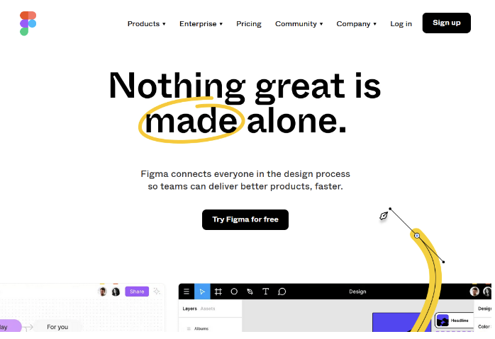
Figure 1. Figma home screen
To use the application we need a user account. If you don’t have one yet, the first thing to do is to register (in the tab Sign up).
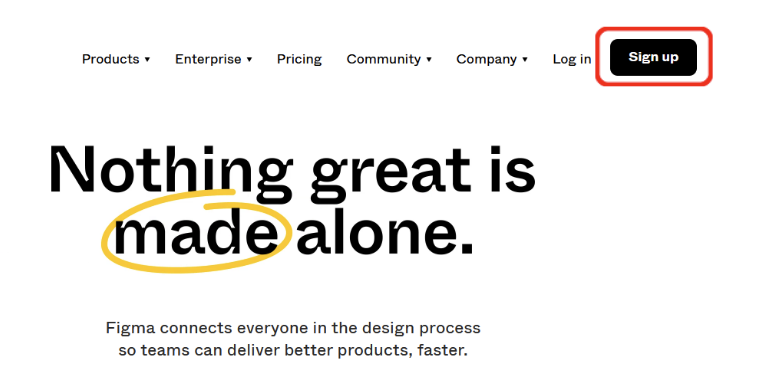
Figure 2. Create an account on Figma
The platform gives us the option of registering with a Google account.
If we already have an account, access to the application using Log in tab.
Once we log in with our account, we will have to complete our profile data and create a work team.
In the following figures you can see how the “Creatit team” has been created. Here we can add different users to collaboratively design our app. Since we are going to use Figma in its free version, the name of the team matches the name of the project. In each team created, we can work with three designs. We can create as many teams as we want, but never more than one project. For simplicity, we are going to work with only one working team.
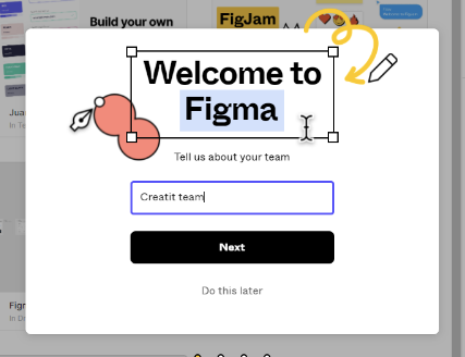
Figure 3. Create a new team in Figma
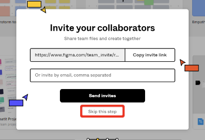
Figure 4. Adding users to the Figma team
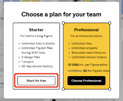
Figure 5. Selection of the type of project plan in Figma. Left: free plan Right: professional plan
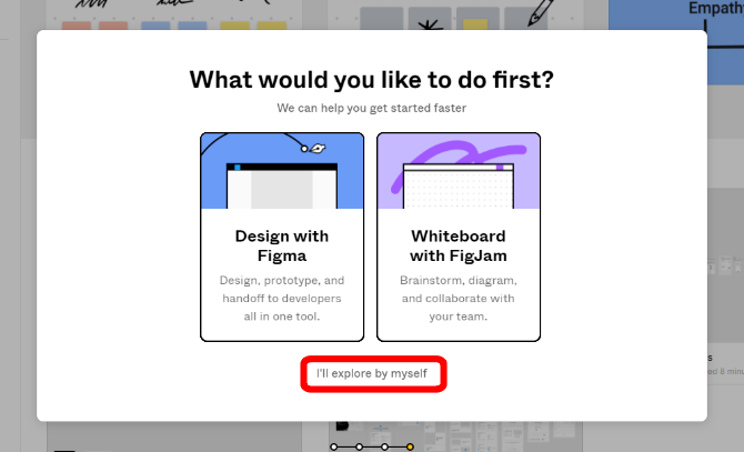
Figure 6. Help from Figma for the creation of our first project
Figure 6 shows the options that appear in Figma the first time we access the platform after registration. We advise you to choose to explore by yourself, which will lead you to the main interface (will be the case for the next few times you enter).
MAIN VIEW:
Let’s take a look at what Figma’s main interface looks like:
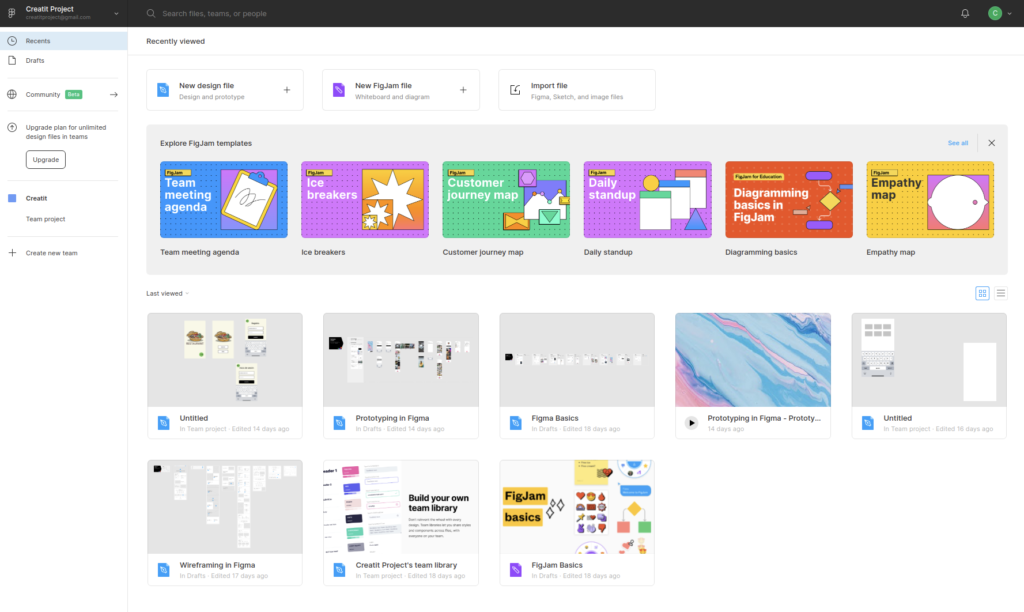
Figure 7. Figma main interface
In it we find some designs in drafts and on team project.
If we click on the tab drafts we will see all our templates. The designs in draft are personal and are not visible to the other members of the working team. The application allows us to have an unlimited number of them. All designs in draft can subsequently be moved to the project team.
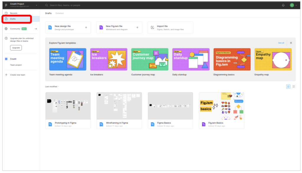
Figure 8. Drafts in Figma
When we click on team project we see the designs that all team members are working on (up to three in the free version).
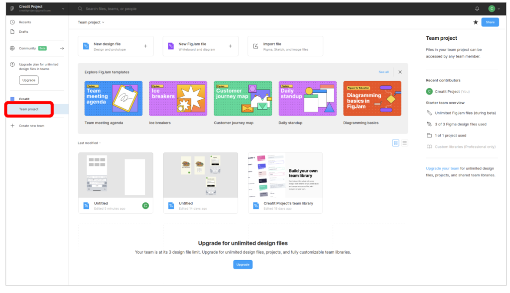
Figure 9. Designs in the team project
CREATING A NEW DESIGN:
To create a new design within our project team, we have to click on the symbol + and select “Design file” as shown in figure 10.
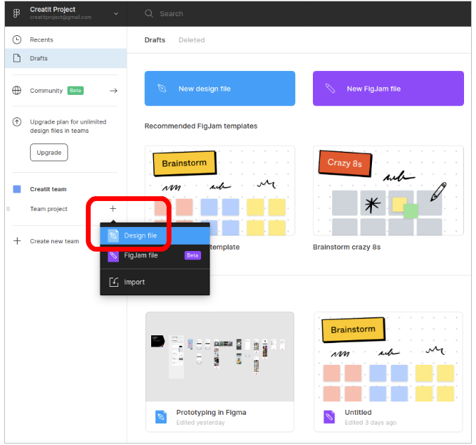
Figure 10. Creating new project design in Figma
Once our design template has been created, right-click on the design and select the option Open.
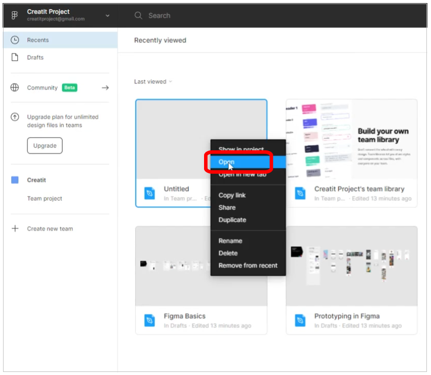
Figure 11. Selecting and opening a design in Figma
APPLICATION EDITOR:
Once we have created our working template, we will explore the different options and tools available in Figma to design our application.
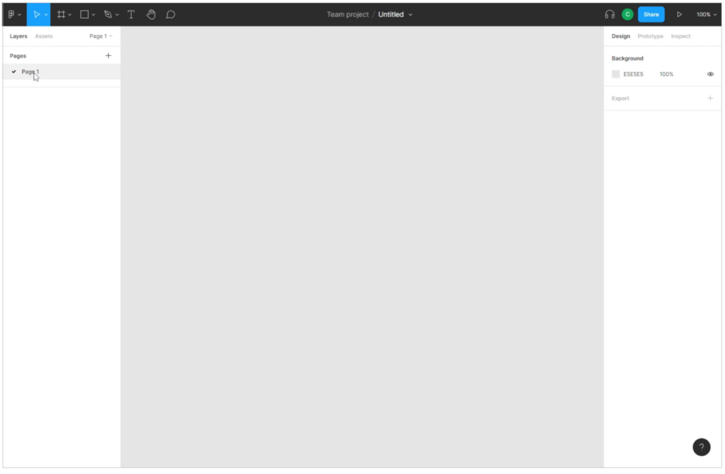
Figure 12. Main view of the Figma editor
> DESIGN FRAMEWORK:
From the Figma editor, we choose the design framework. To do so, we follow the steps in figure 13.
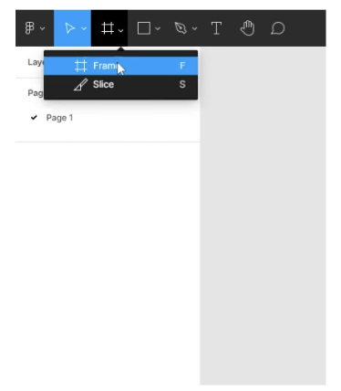
Figure 13. Opening of design frameworks in Figma
Below we see the different framework the tool offers us. We select the platform for which our application will be designed (Smartphone, Tablet, PC, etc…).
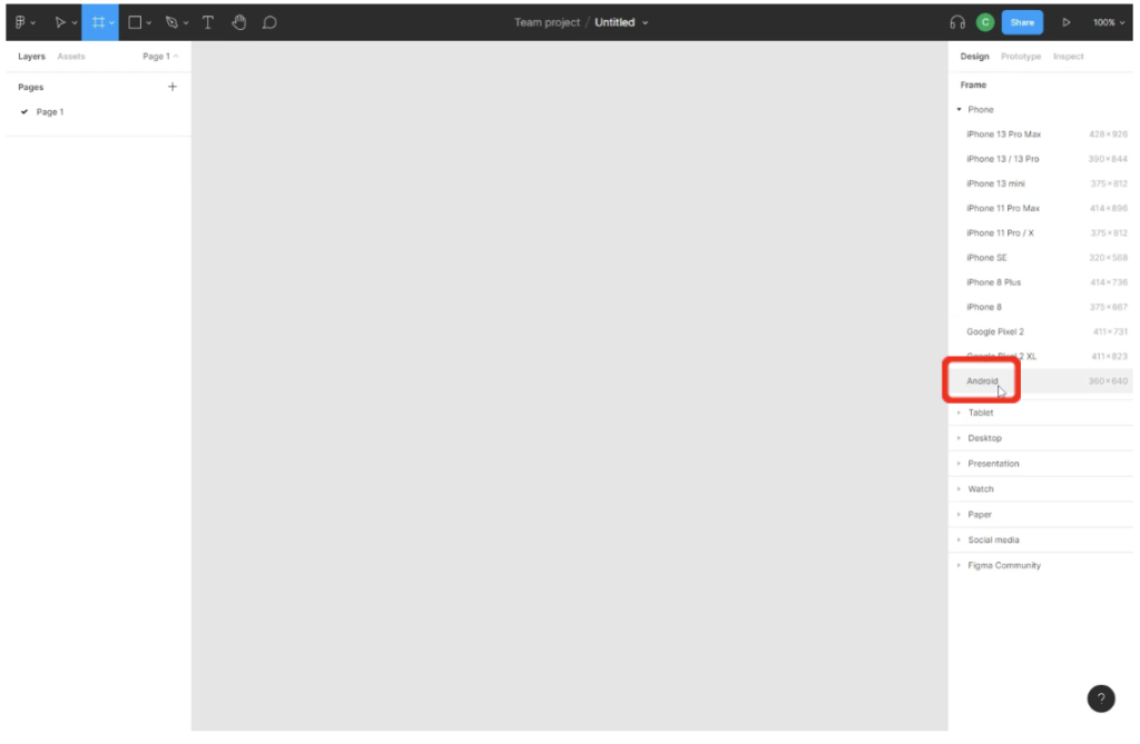
Figure 14. Framework selection on Figma
Once the framework has been selected, we see the working canvas in the editor. The shape and size will depend of the type of frame chosen.
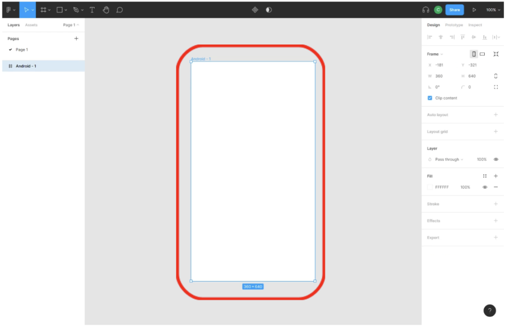
Figure 15. Example of a Smartphone framework in Figma
Once we have chosen the framework for our application, we can start adding other elements to it, as we will see below.
> FORMS:
From tab forms we can add different forms to our app such as rectangles, lines, arrows, ellipses, polygons and stars. We can also insert images. Let’s add a square to the design.
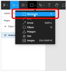
Figure 16. Adding forms to the Figma design
If we click on the shape, in our case a box, on the right side of the screen we will have the editing properties of the object such as position, orientation and fill color among others.
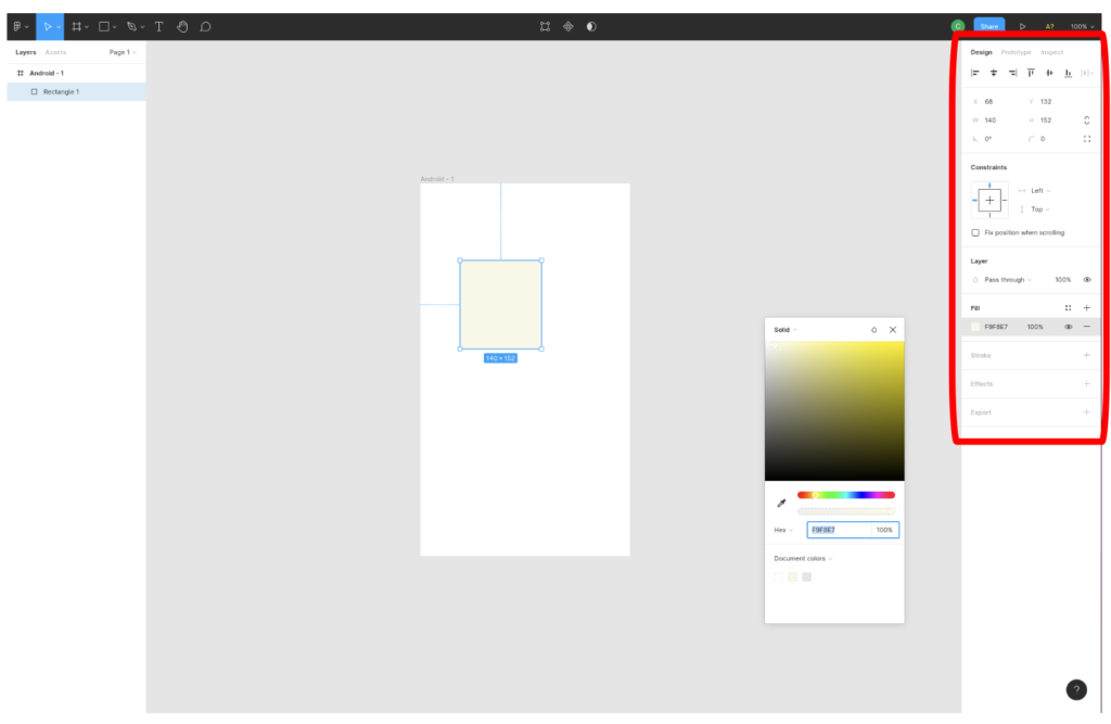
Figure 17. Editing options on Figma figures
> TEXT:
To add text to our application, we will do from the button highlighted in figure 18. We then drag the text box onto the working canvas. Once added, we can modify both the location and the size of the text box.
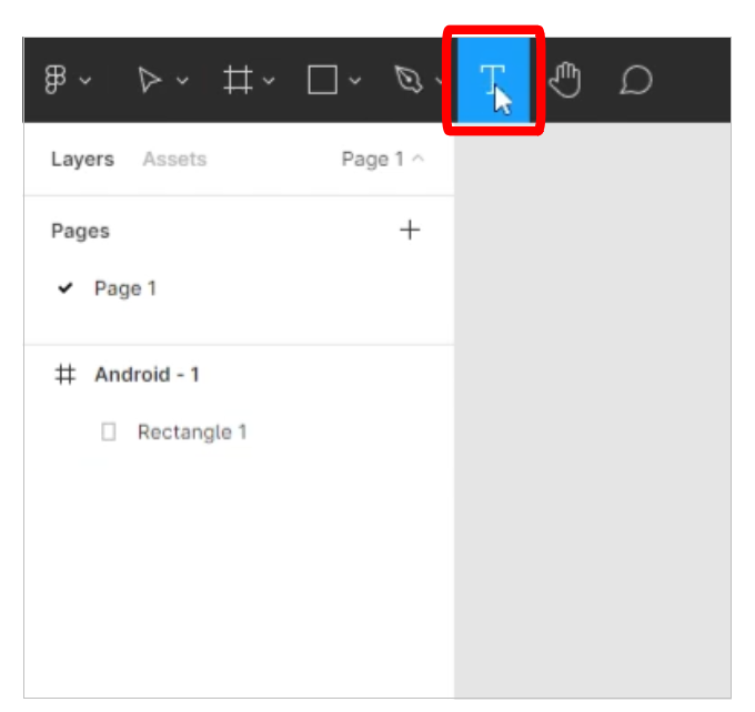
Figure 18. Adding text to an application in Figma
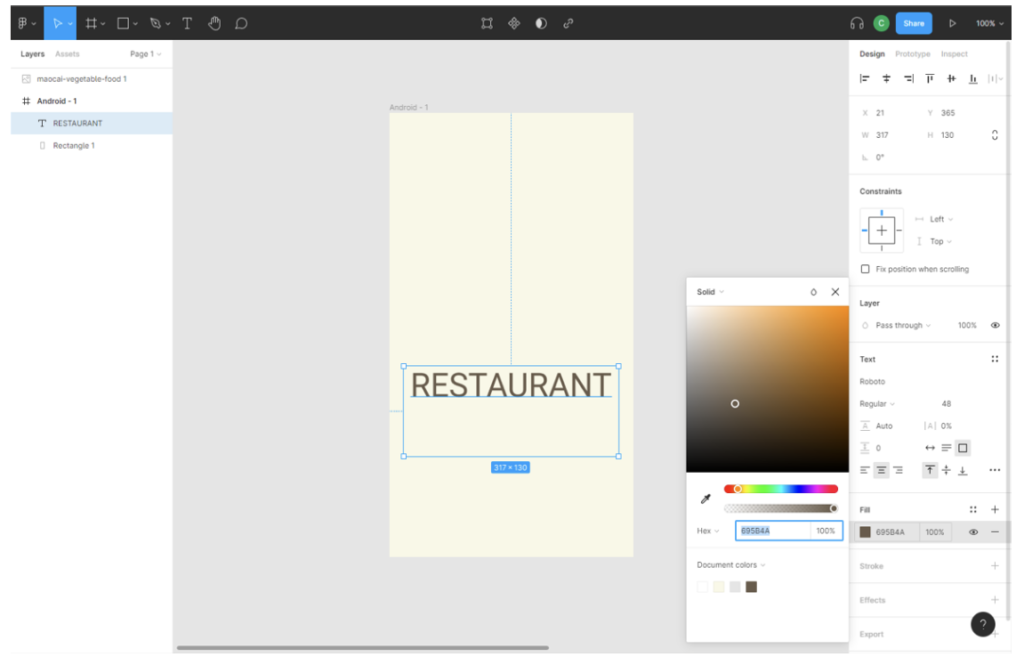
Figure 19. Editing options on text boxes in Figma
> IMAGES:
We can also insert images into the application from our computer. To do so, we follow the steps in figure 20.
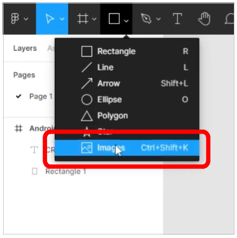
Figure 20. Adding images in Figma
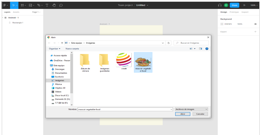
Figure 21. Adding images to Figma from your computer
Once the desired image is selected, right-click outside the view frame to add the image. The result is shown in Figure 22.
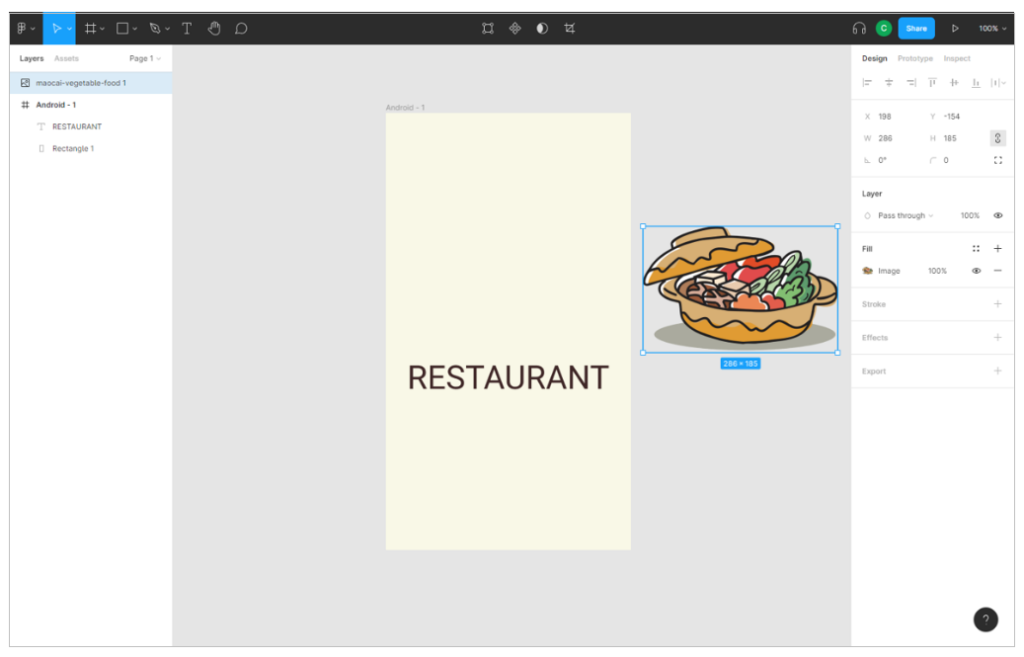
Figure 22. Adding images to Figma
Like shapes and text boxes, we can drag and resize images using the editor options (figure 23).
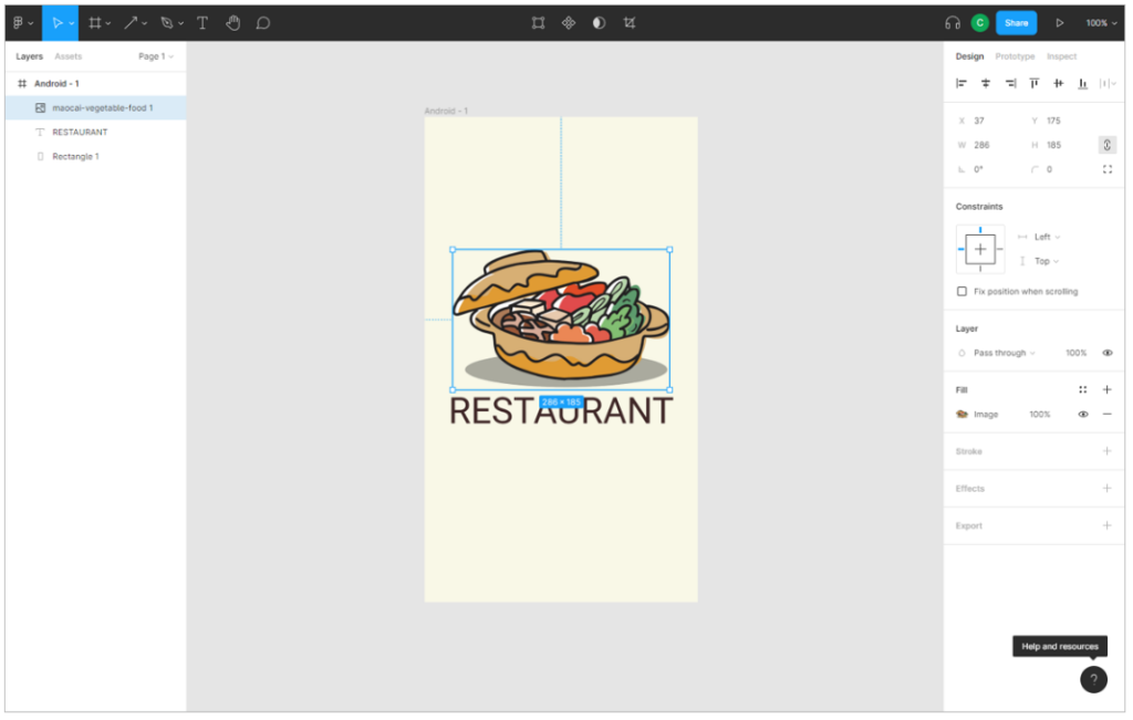
Figure 23. Image editing options in Figma
At this point, all elements introduced in the application were static, i.e. the user cannot interact with them. Next we will learn how to introduce dynamics to our application.
> INTERACTION ELEMENTS:
Interaction elements can be created by us or imported from Figma examples. The following shows how to introduce an interaction element created by us. The following two figures show how to add an interaction object (figure 24) and how to customise it (figure 25).
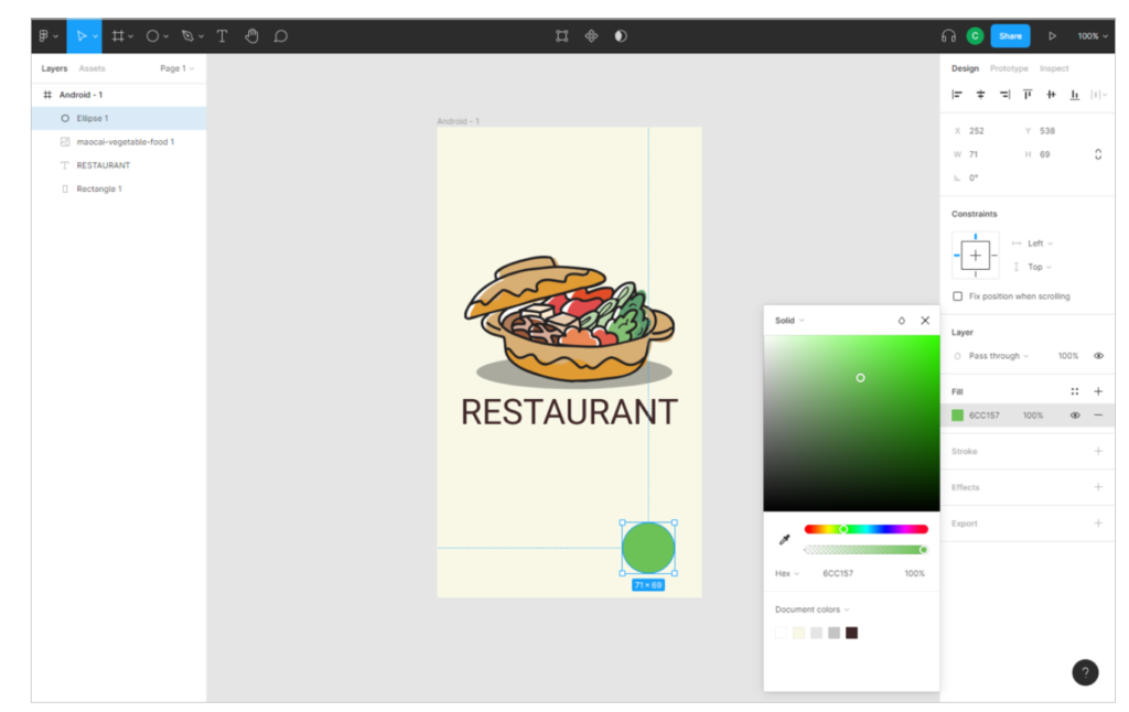
Figure 24. Adding interaction objects in Figma

Figure 25. Customizing interaction objects in Figma
Throughout the course we will see how to bring our applications to life using interaction objects.
ZOOM
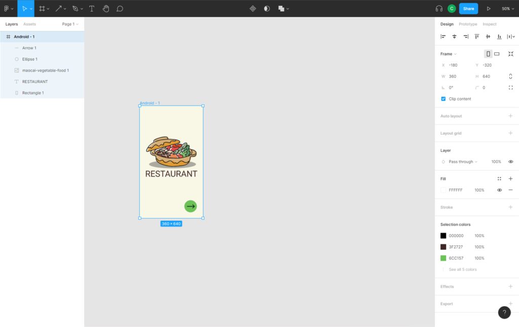
Once we have defined the main page of our application, we will now expand the workspace in the Figma editor so that we can add more scenes or frames to our application.
To resize the workspace, follow the steps in figure 26.
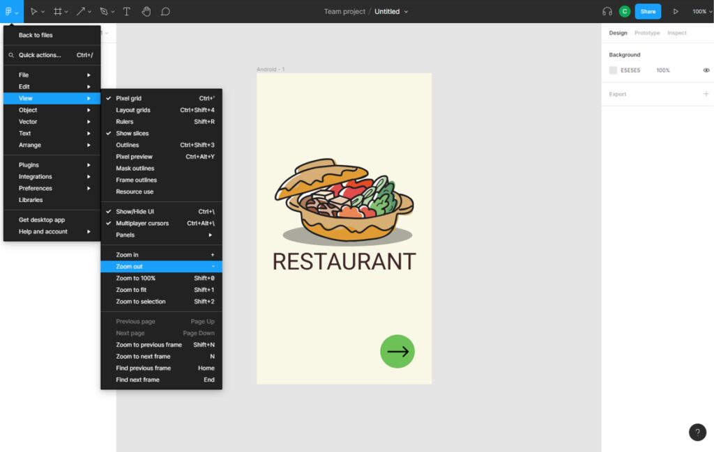
Figure 26. Zoom-out the edit view in Figma
Depending on the zoom level selected, we can add more or less frames to the application. The final result of the zoom is shown in figure 27.
Figure 27. Figma editing view after zoom-out
ADDING NEW FRAMEWORKS
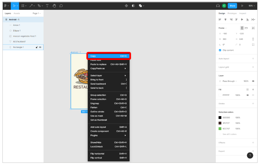
Now, We are ready to add new views to our application. The easiest way to add new macros is to duplicate the one we already have. To do this, we click with the right mouse button on our macro and select the “copy” option as shown in figure 28.
Figure 28. Copying a macro in Figma
finally, right-click and select the option to paste into the workspace.
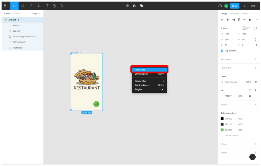
Figure 29. Paste a macro in Figma
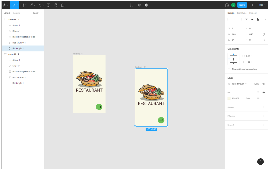
The final result can be seen in figure 30.
Figure 30. Duplication of a Figma frame
the last step before continuing with the design of this new view of our application is to remove all the elements of the duplicated framework. If we have followed all the steps, we will obtain a result as shown in figure 31.

Figure 31. Add a new frameworks in Figma
Now, we go to the main interface to search for standard elements in the Figma examples.
STANDARD ELEMENTS
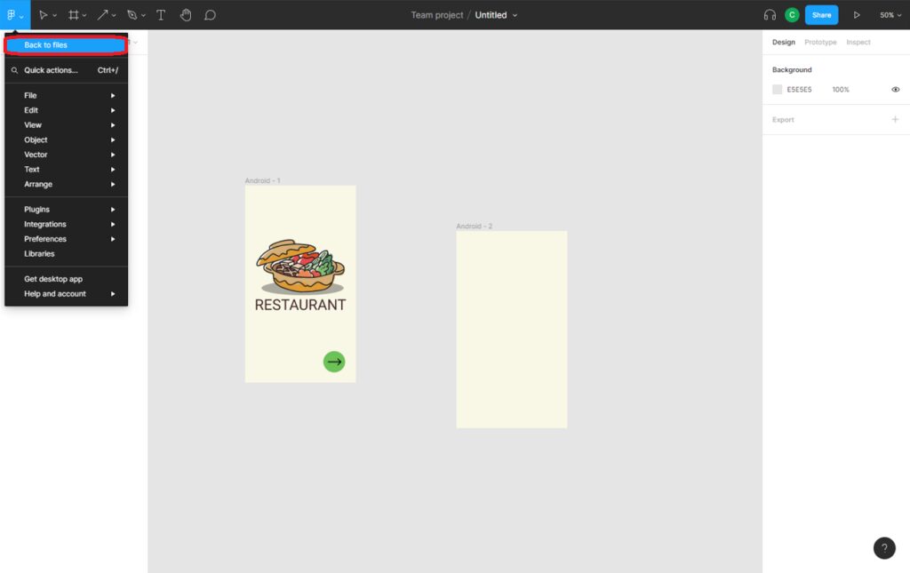
To design our app, in addition to the elements we have seen so far, in Figma there are other types of pre-designed standard elements that we can reuse in our designs. In order to use of them, we have to exit to the main interface (see figure 32).
Figure 32. Access to the main interface in Figma
From the main tab, on “Prototyping in Figma” we can find many pre-designed frames containing text inputs, keyboard inputs and other elements that we can reuse in our designs. To access the Figma framework catalogue, follow the steps in figure 33.
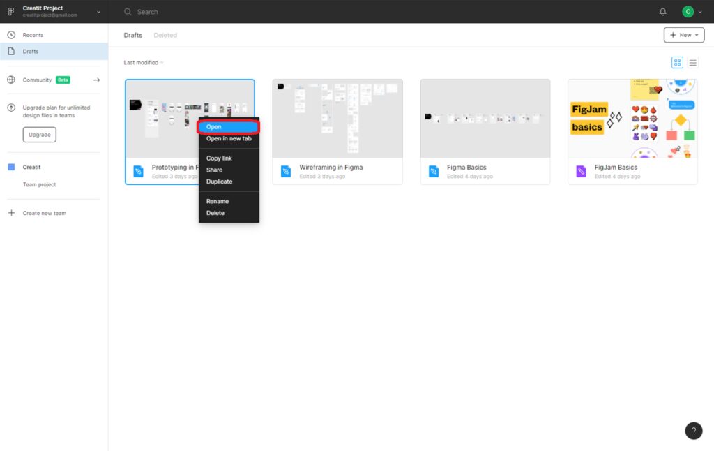
Figure 33. Access to Figma’s frame catalogue
If we want to reuse any of the examples available in Figma, we only have to select the frame(s) containing the elements we want to reuse and copy it into our application. The steps are detailed below.
First select the frames and click on “copy” (figure 34).
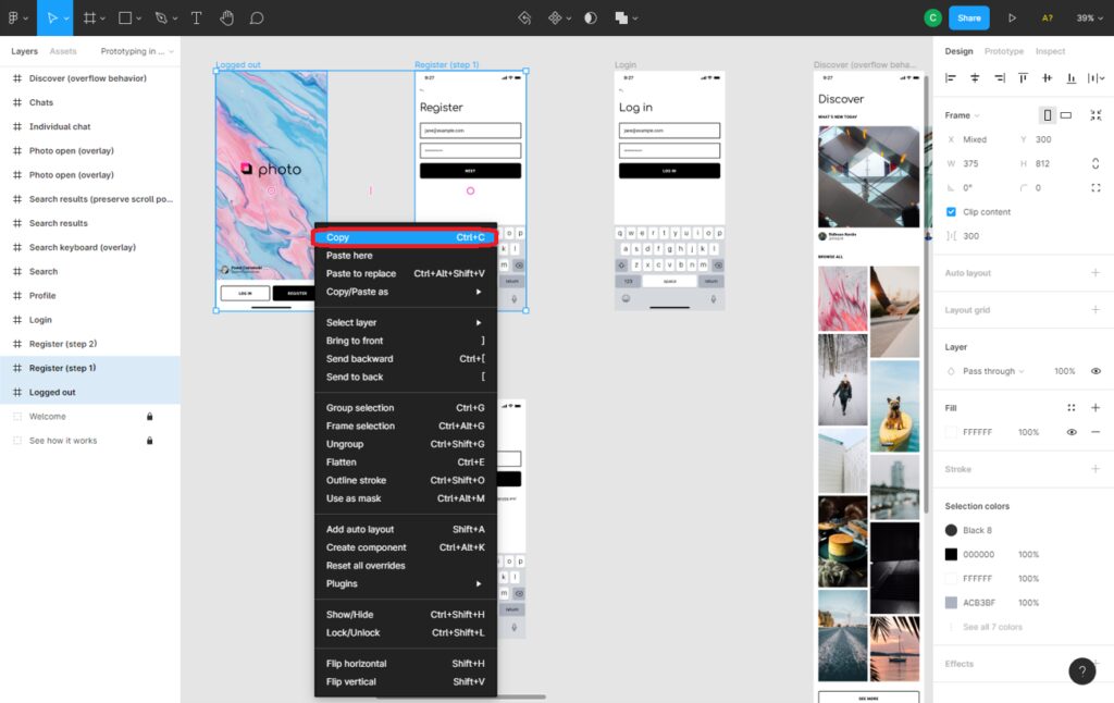
Figure 34. Reuse of example frameworks in Figma
Then, we exit the “Prototyping in Figma” (see figure 35)
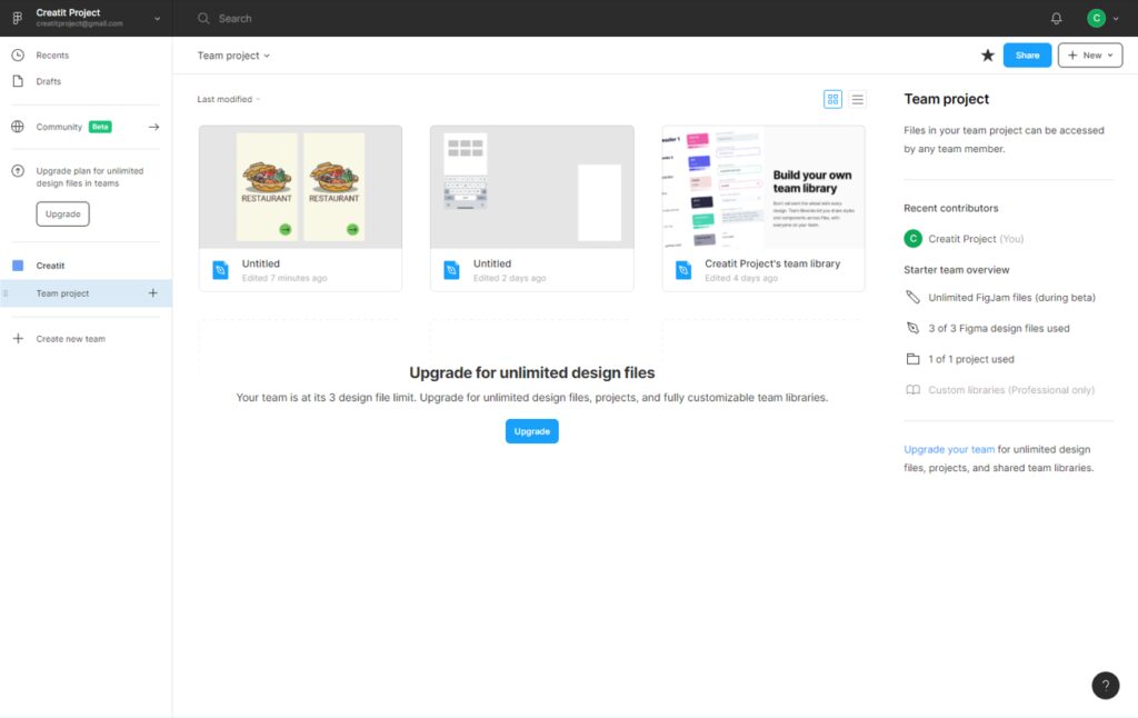
Figure 35. Main project screen in Figma
then we open our design (see figure 36).
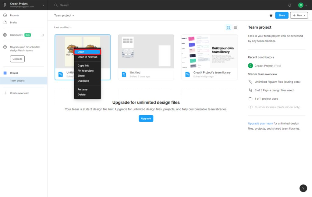
Figure 36. Selecting and opening a design in Figma
we apply again zoom-out as we saw in the previous section and paste the Figma views we have previously copied (the ones that contains the elements we want to reuse). We see the result in figure 37.
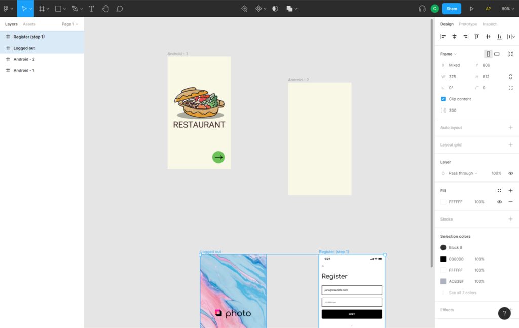
Figure 37. Adding Figma frameworks to the application
Once the example frames have been added, we can start to reuse the elements they contain. For example, if we want to use a button, we select it and duplicate it, i.e. copy and paste it.
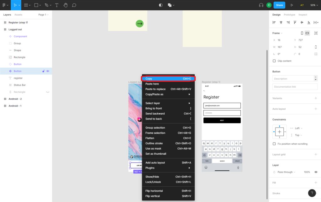
Figure 38. Copy a button on Figma
Repeat the process to add another button. The result is shown in figure 39.
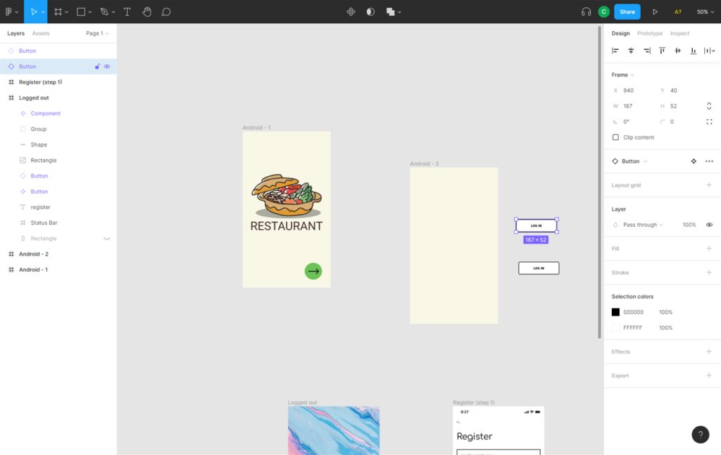
Figure 39. Copy a button on Figma
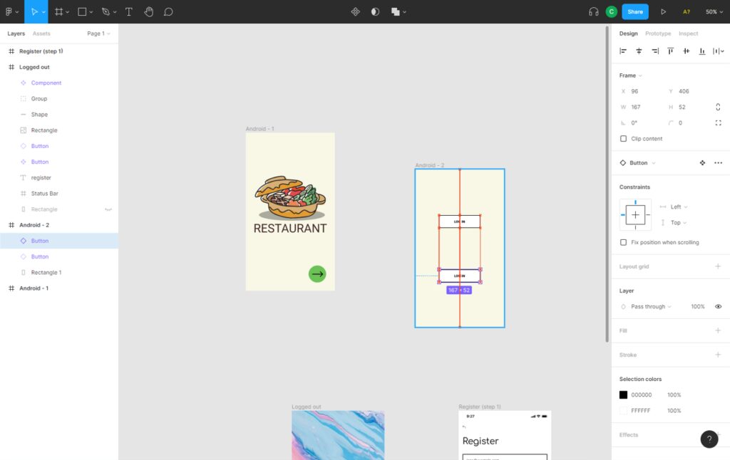
Once we have the buttons created in the workspace, we must drag them to the desired positions within one of the frames of our app. We click on them and drag to the second frame of our application. See figure 40.
Figure 40. Positioning objects in the Figma editor
We can modify the text displayed on a button by selecting and double-clicking on its text. In the first button we will put “start” and in the second one “register”. The result is shown in figure 41.
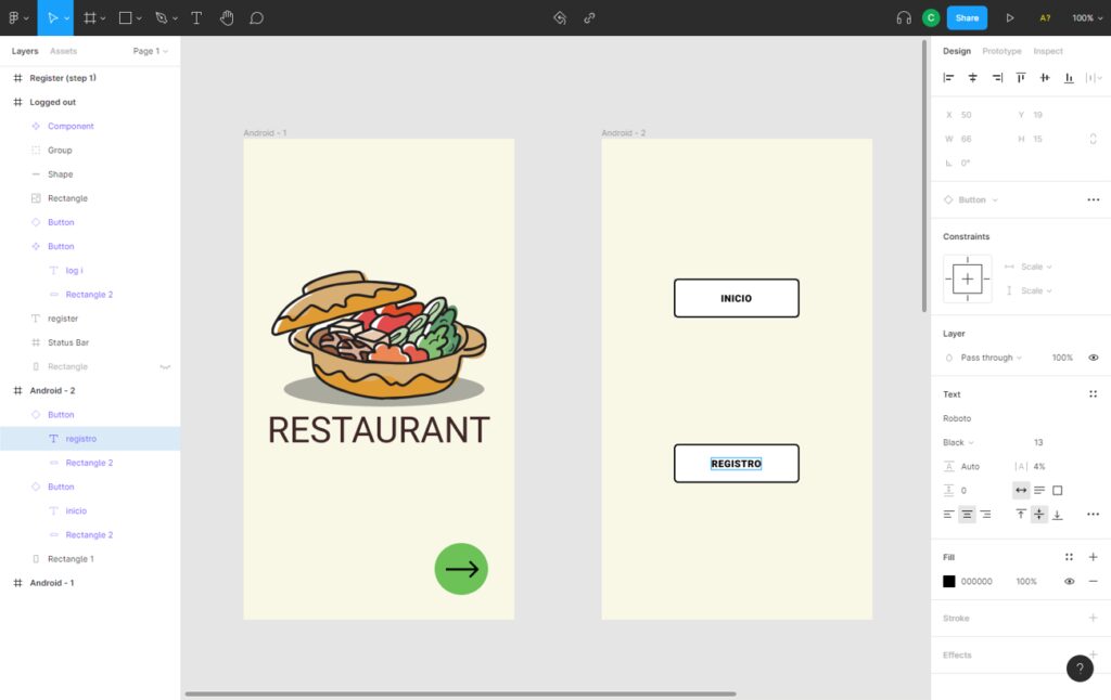
Figure 41. Modifying the text of objects in Figma
Both buttons will redirect us to two tabs in our application, let’s create them.
Let’s start with the registration window. To add a new frame we duplicate an existing frame as we have seen in previous chapters. In this new window we want to add new Figma’s objects, text entries. With these, the user can enter his or her credentials in the application.
We are going to reuse the text input object present in the default sigma views that we have imported (see figure 42).
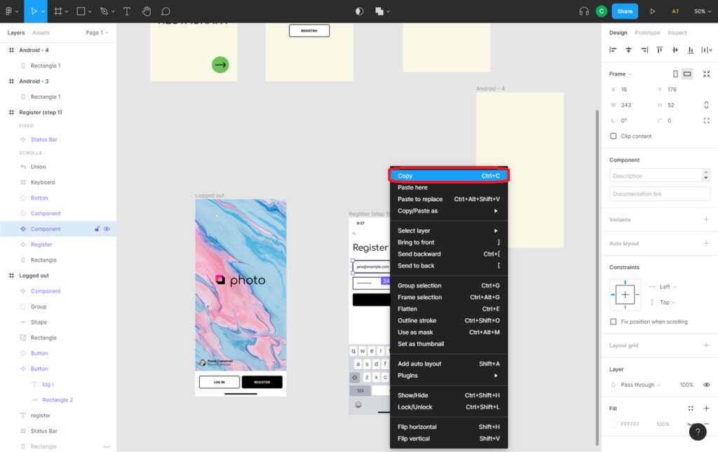
Figure 42. Duplicate text box object in Figma
then paste the text box object over our new frame, which will be the registration window in the app (see figure 43).
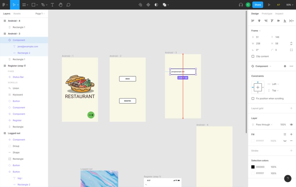
Figure 43. Add text box objects in Figma
Repeat the above steps twice to add two text boxes to the view. One for entering the user name and one for the password. We will also add two buttons, one to log in and a back button to return to the main tab of the application. The result is shown in figure 44.
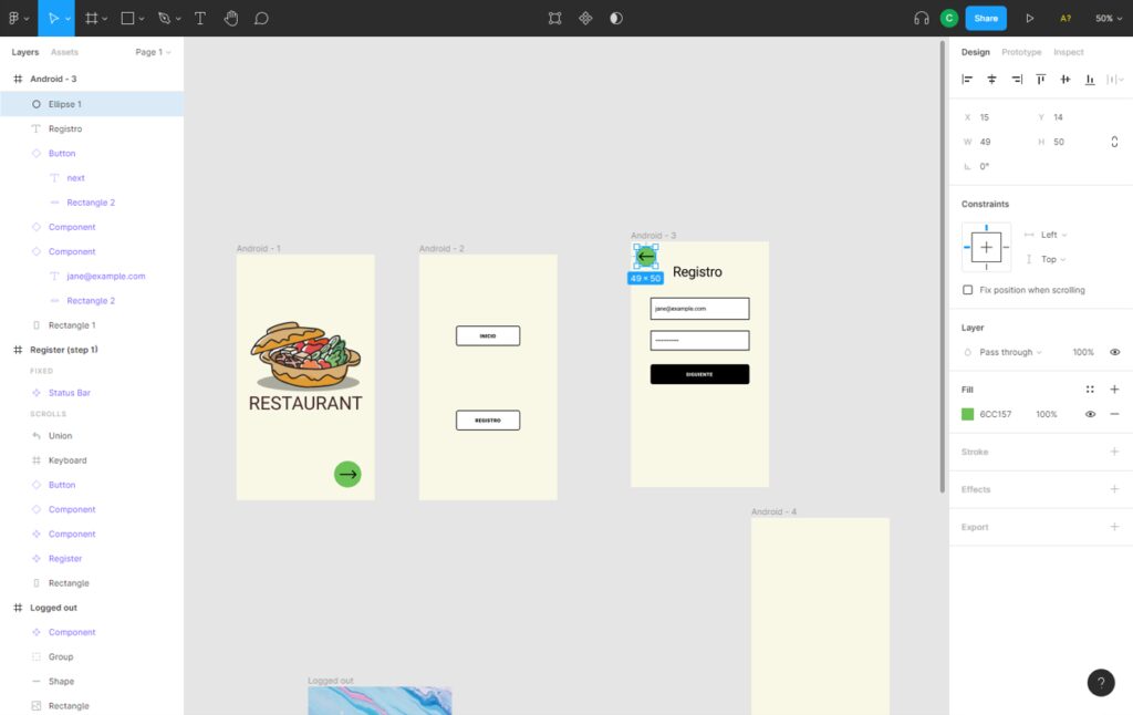
Figure 44. Using text boxes in Figma
The last step before finishing our registration window will be to add a keyboard for the user to enter their credentials. To do so, we will reuse the object keyboard from the default sigma framework (see figure 45).
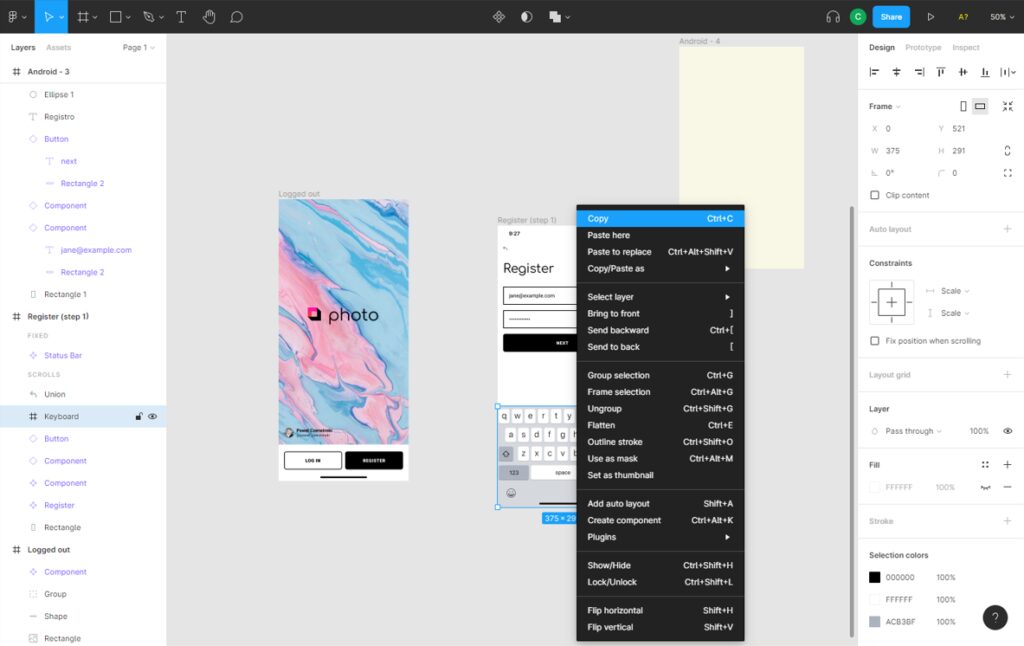
Figure 45. Keyboard object in Figma
the final result of the register view of our app is shown in figure 46.
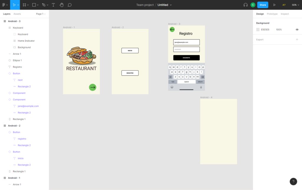
Figure 46. Design a registration window in Figma
Once we have finished the registration framework, duplicate it to create the login framework. These tabs will be very similar. All we have to do is change the text in the main box. The result is shown in figure 47.
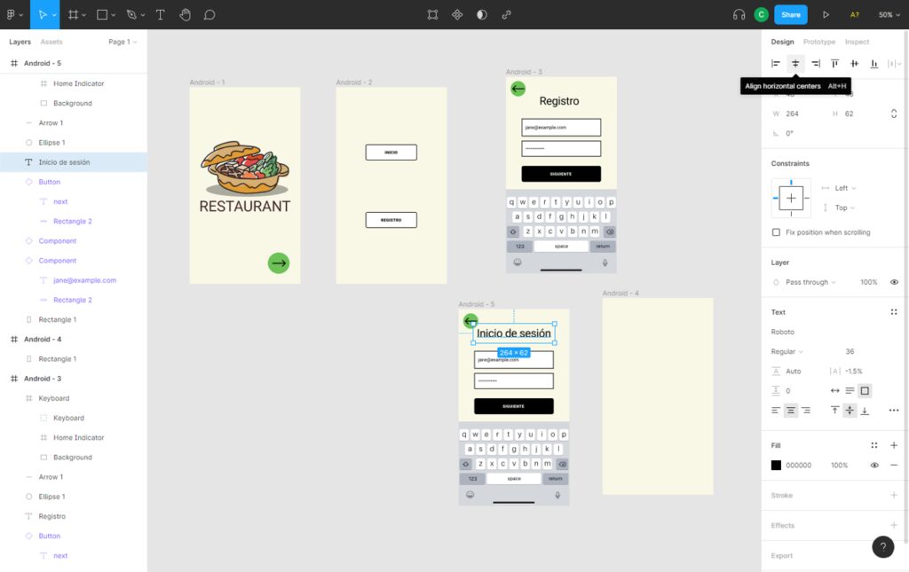
Figure 47. Design a login window in Figma
Once we have used all the objects we are interested in from the Figma frames, we remove them as they will not be part of the final design of the application.
INTERACTIONS
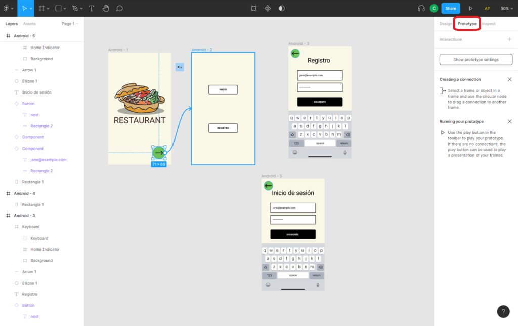
Now, it is time to add dynamics to our application. We want the user to be able to navigate through the different views of the application using the buttons we have added. To add interactions between frames, the editor mode must be changed to “Prototype“.
Figure 48. “Prototype” view in Figma
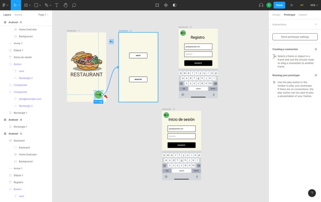
If we select an element in prototyping mode, we have the option to create an interaction by dragging an arrow to the next frame. All this is done automatically. First we will link the button on the main page of the application to the Home/Registration frame. To do this, we follow the steps in figure 49.
Figure 49. Adding interaction between two objects in Figma
We continue with the interactions in the app, this time linking the registration / start buttons with their respective windows. See steps in figure 50.
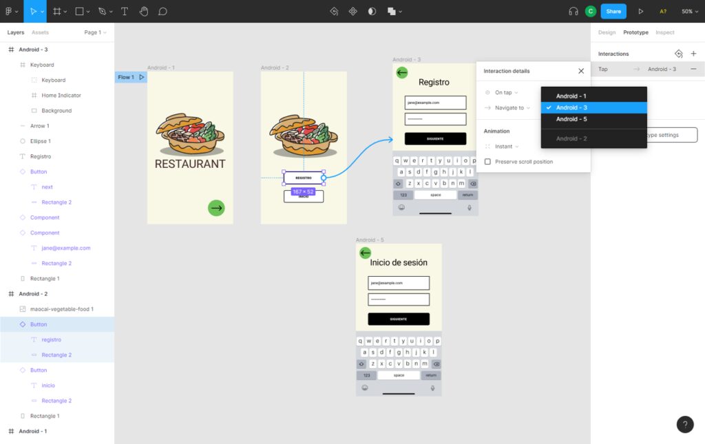
Figure 50. Add dynamics in Figma


